Canadian Tire Mobile App
Visual Designer · UX Designer
Company
Canadian Tire Corporation
Industry
Retail · E-commerce
Role
UX Strategy · Design Lead · Design Systems
Year
2022-2024
A native app that finally felt like Canadian Tire.
Canadian Tire's mobile app was a legacy web-based experience that didn't meet modern native UX standards. The App Store rating sat below 3 stars, the design language lagged the brand's evolution, and a waterfall development process slowed iteration.
I led the visual direction and design language for the redesign — translating user research, business goals, and brand into a scalable native mobile experience built around product discovery, in-store availability, and a streamlined checkout.
- Lift App Store rating & customer sentiment
- Improve mobile conversion & checkout completion
- Align the app with Canadian Tire's evolving brand
- Move from waterfall to agile design sprints
- Find products faster across categories
- Check in-store availability in real time
- Pick between pickup and ship-to-home with confidence
- Use the app comfortably with assistive tech
My responsibilities — UX strategy, design language, scalable Figma libraries, design-sprint facilitation, and championing accessibility across the team.
Customers struggled with a slow, web-wrapped legacy app.
Before the redesign, the mobile app sat at sub-3 stars on the App Store. Customers couldn't find products fast, couldn't trust availability, and the team couldn't iterate quickly enough to fix it.
Legacy, web-wrapped app
The previous app was a thin shell over the website — slow, generic, and missing native patterns customers expected.
Sub-3-star rating
Low App Store sentiment was hurting downloads, repeat sessions, and trust at a critical mobile-first moment for retail.
Waterfall development
Rigid hand-offs blocked iteration. Research findings weren't translating into shipped UI fast enough to keep up with the brand.
From legacy audit to native design system in sprints.
UX strategy & audit
Audited the legacy app against native iOS/Android best practices, mapped friction in product discovery and checkout, and aligned with stakeholders on the redesign goals.
Design language & system
Built a scalable Figma library — components, typography, color, interaction patterns — so the app could ship consistently across categories and partner teams.
Design sprints & iteration
Replaced waterfall hand-offs with cross-functional design sprints. Translated research insights into mockups, prototypes, and shipped UI on a much tighter loop.
Accessibility & polish
Championed accessibility (contrast, hit areas, screen-reader labels) without compromising brand expression, and refined product detail, availability, and checkout flows.
What testing revealed — and what we changed.
We pressure-tested the new flows on real Canadian Tire customers — measuring how confidently they could find a product, check stock, and complete checkout on a phone.
Availability surfaces trust
Pulling 'in-store availability' onto the product detail page and showing exact in-stock counts noticeably increased confidence to add to cart.
Pickup vs. ship-to-home
Framing fulfilment as a single choice with clear pricing reduced bounces on the buy step versus the legacy multi-screen flow.
Vehicle-aware tire flow
Letting members select a vehicle once and seeing 'fits your 2012 Ford Escape' on tire detail removed a major source of cart abandonment.
A native, brand-aligned shopping experience.
Product pages now lead with imagery, ratings, in-store availability and clear pickup vs. ship-to-home choices. Tires gained a vehicle-aware flow, and a new store locator made the closest Canadian Tire easy to find on the go.
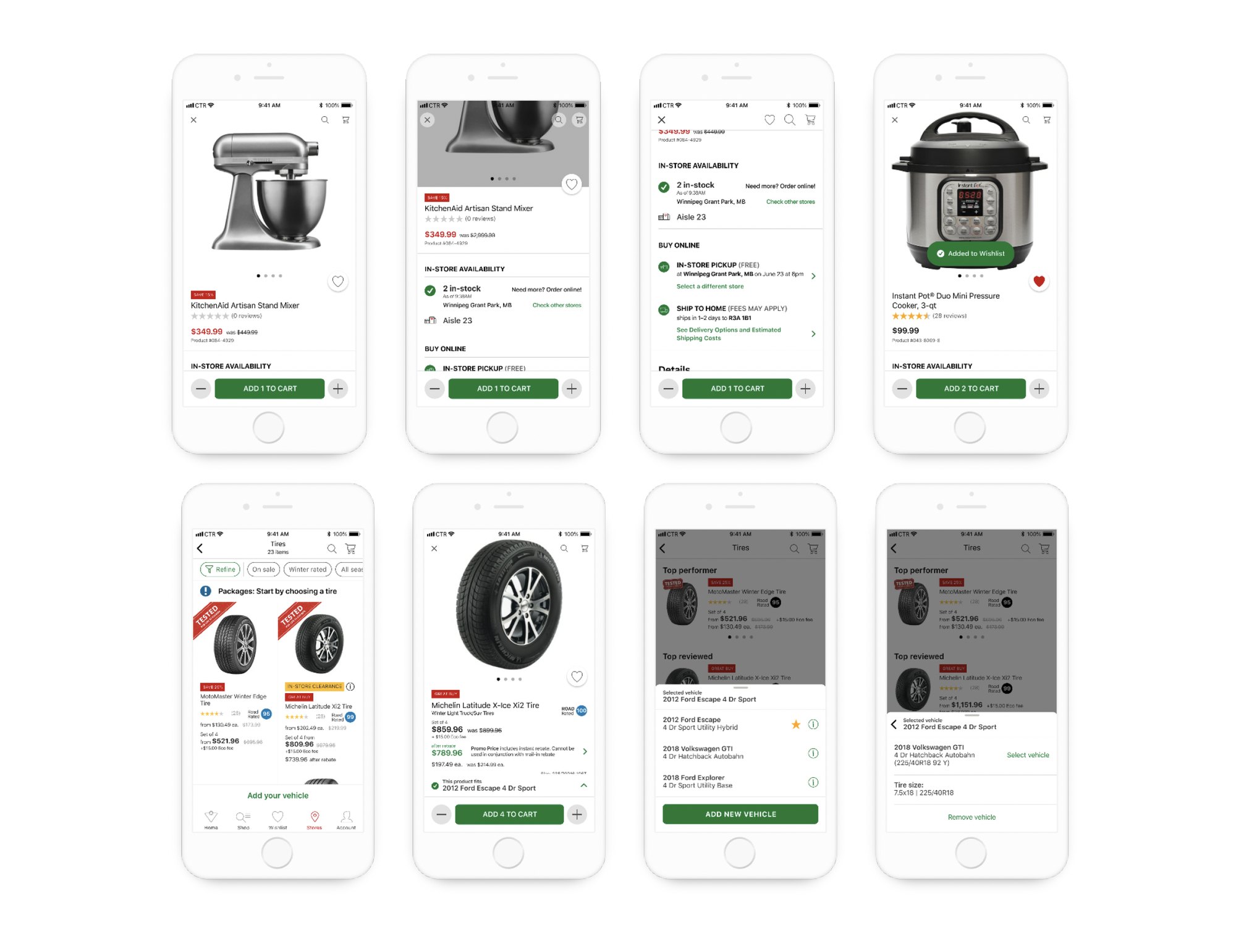
Hero imagery, ratings, in-store availability and pickup vs. ship presented as one clear decision.
Members add a vehicle once and see exactly what fits — from packages to single tire detail.
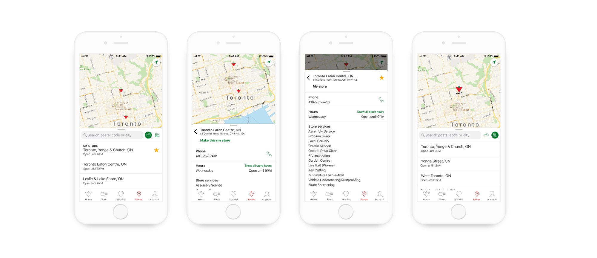
Map-led store finder with hours, services and a one-tap call to your local Canadian Tire.
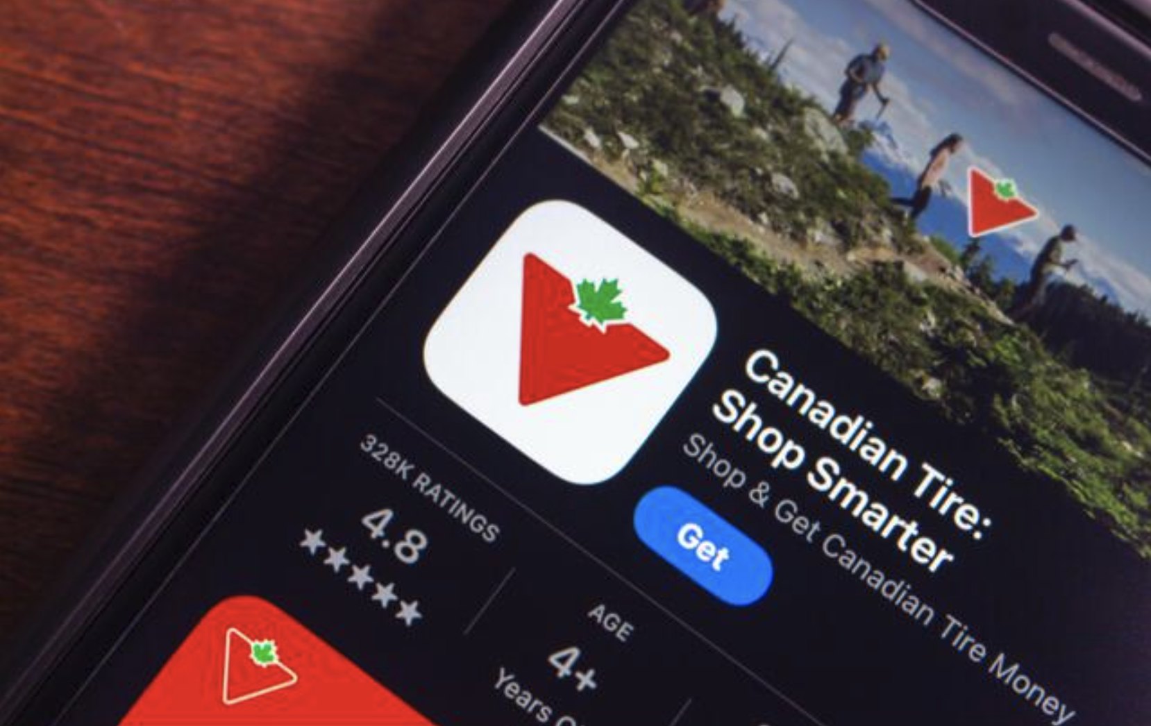
4.7★
App Store rating after launch — up from below 3 stars on the legacy app
- App Store rating: 3.0 → 4.7
- Stronger customer sentiment across reviews
- Scalable Figma design system adopted org-wide
- Established a sprint-based UX culture inside the team
The redesigned app launched as a true native experience, lifting the App Store rating from below 3 stars to 4.7. Customer sentiment improved across reviews, and the new design system + sprint cadence let the team ship faster while staying on-brand.
What redesigning Canadian Tire's app taught me.
Native beats web-wrapped
Investing in native patterns paid off in perceived speed and trust before any performance work landed. Customers feel the difference immediately.
Design systems unlock speed
A well-structured Figma library let designers and partner teams ship consistently — and gave engineering predictable, reusable building blocks.
Accessibility ≠ compromise
Treating accessibility as a brand-expression constraint, not a checklist, made the app stronger visually and more inclusive at the same time.
Sprints translate research into UI
Replacing waterfall hand-offs with sprints closed the loop between user research and shipped product, and rebuilt momentum across the team.
Credits — Collaboration with Canadian Tire's product, engineering, brand and research teams across multiple sprint cycles.